Friday 17 December 2010

Evaluation.

In what ways does your media product, use, develop or challenge forms and conventions of real media products?
In real music videos, there are several different forms and conventions that are used to ensure the audience is kept gripped and entertained throughout the viewing. These are such things as repetition, fast cuts, a variety of different shots, a good storyline and a good performance. I wanted to make sure I got all of things into my music video to try and make it as professional as possible. I have followed these conventions due to several different theorists' views, these are; Richard Dyer with representation and Roy Shuker with a connection to the audience.

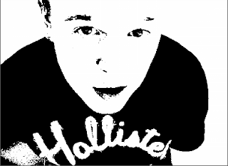
I edited the artist into a black and white cartoon colour, threshold, which I had wanted to create from the start. I did want edit my artist into a colourful cartoon but thought that it would look more ‘indie’, which is the genre of my song, if it was in a simple black and white.The final black and white colours portray the idea of the song and the artist himself. As the song is quite mellow and gloomy, black and white matches the feeling that the artist is trying to put across. The convention that I was following here was to match the way the video looks to the type of song it was, this would bring across originality and also connect the audience to the artist, as Roy Shuker suggests in his theory.


Another convention that I used was to use a variety of shots of my artist from different angles. Including close-ups, long shots and mid-shots. The close up of his face as he moves up slowly to stare into the camera and sing the line ‘maybe we can make this change’ shows the emotion as he sings for the couple to try and make their situation change. As he is looking straight into the camera for this close-up shot, the audience will feel as though they are connecting with the artist, also used to follow the theory of Roy Shuker.


Fast cuts, according to Goodwin, are another current convention used in music videos. Throughout the scenes of the artist playing his guitar to the song, I used a lot of quick cuts to different angles of him. This happens quite a lot in the video, especially the first time that Sam (my artist) is seen. He sings one line, yet there are four cuts from a mid-shot to long-shot, to a close-up of his face and a close-up of the guitar being played. This allows the audience to keep up the exciting intensity of the video as well as creating a sense of pace. This is a common occurrence in modern day indie music videos, so using this gives it that professional feel.


I also ensured that I used well lit scenes during the filming of my music video, yet another convention that is vastly followed by music video directors. This is definitely a necessity to ensure that each scene is clear and the audience gets all the information they need, as well as as keeping them interested. If this was not possible on set, I made sure that when I came to editing the video I changed the brightness and contrast of the ‘problem scene’. There was a particular scene, where Alex (my actress) and Sam are in the bathroom smiling into the mirror, that I was worried the lighting was an issue, but when I got around to editing it I was able to enhance the brightness to take away the problem. As this was a very intimate scene and needed to be a warm and bright one, it was a very important point that I needed to improve. If the scene was seen as dark and gloomy, but the characters were bright and smiling, it would not really bring across the message as fully as it can now I have edited it.

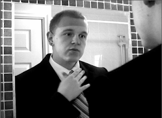
The music video includes a lot of repetition, another convention of modern day music videos. Seeing as my video tells a story as well as having an artist performance, repetition is good in the storyline to allow the audience to get to grips with the narrative and properly understand it. Sam is shown four times doing his tie up in a black and white colour, which really proves a point to the audience, that he does not want to be stuck in his 9 to five job anymore, staring into the same mirror in the same mood.


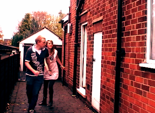
Another convention that I used, along with the lighting convention, is the colour effects I edited into my video. I really wanted to contrast the storyline against the artist. As the narrative explains a love story becoming something new and coming into its own, I wanted to make the colours warm and bright, against the dark and indie colours of the artist (black and white, threshold). I therefore changed the colour balance to make it look as though the couple is in a sunset colour whilst they go through their new lives. The reds and oranges that reflect off them in each scene, after they dissolve back in and seem happier, prove the point that things have changed for them and they are now in a brighter and happier place. Edits to colour are a huge convention of modern-day indie music videos. A lot of artist/bands use colours to enhance the way they want to look or the way they want their video to come across, which is what I was going for, I wanted to make the couple’s scenes richer and differ completely from the black and white they were in before, as they are out of the dark and into the light. An example of this is seen in the scene where Alex and Sam both run out of the house, the bricks can be seen in a rich brown and red colour, which is definitely eye-catching.


I also challenged the conventions of indie music videos by using a few dissolves. It seems that a lot of straight cuts are used in music videos, which I have used throughout my edit, yet, seeing as my artist’s song matches with the dissolves they work well. There are parts in the video, for example the lines ‘washed out and fade away…’ and ‘patterns begin to fade…’ which have meanings to allow the dissolves to work. When the couple is together, yet ‘fading away’ the fade comes into play and gives a good effect on the lyric. The dissolve narrates the couple’s lives slipping away from them day by day, allowing the audiences the opportunity to understand by watching this happen as well as listening to the lyric. The fade in with a white colour also does this. We see the ‘patterns fading’ when the fade in occurs and the couple are no longer in a dim, dark colour but a bright and rich colour, giving a warm and happy feeling.


How effective is the combination of your main product and ancillary texts?

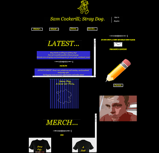
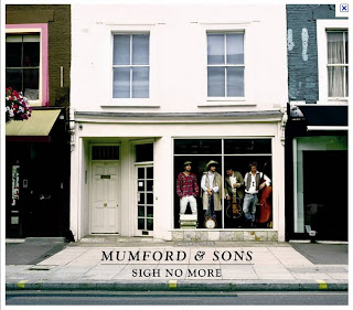
My artist’s website conformed to a lot of different conventions. I used inspiration from Mumford and Sons, saw how simple they made their website and decided that seeing as ‘indie’ follows the idea of simple, yet modern, I would imitate this. I included simple buttons and pictures of the artist as well as the front cover of the cd on the front page. Including a picture of the CD cover allows the audience to get a feel of the connection with the CD and the website and possibly encourage them to buy the CD.


I also made sure that I kept to the colour scheme that I had used on both CD cover and website. Blue, black and yellow (sometimes white) were the colours that are tagged to the artist.
Buttons were another of the ideas that I conformed to whilst creating my website. The buttons are each linked to separate pages, which also have the buttons on them too. This allows the audience to browse through the site with complete ease. When they click onto another page, they are able to choose the next page to visit whilst they are on any page, they don’t necessarily have to be on the home page to link to different page. The colour yellow is used throughout the website text as well as the CD text, so I made sure this was consistent to ensure it looked professional. The buttons are also outlined to make it look neat as well as having ellipsis’ after each word as a ‘tag’ for the artist.


Pictures of Sam are used on the website which allows the audience to relate to him as they know what he looks like, the clothes he wears and his body language. The pictures that I took of Sam were each edited into a red colour which sticks with the bright, edgy layout that has already been designed for the homepage. Editing the pictures gave the website a young, modern feeling. Whereas, when they were in normal colour, they did not stand out or look as effective. Also the fact that I used a picture of Sam on the CD cover links back to the website, allowing the audience to get closer personally to the artist as they can see his face and style in a variety of media technologies.

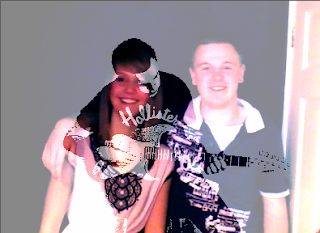
A convention that is definitely used more in the modern day than it ever has been before is merchandise selling. Pretty much all artist sell merchandise at their gigs and on their websites. I decided that I wanted to follow this convention and design a few t-shirts and hoodies for the fans of Sam Cockerill; Stray Dog.
These pieces of clothing are effective on the website as they allow the audience to get even closer to the artist by having the choice to buy designs that have had the influence of the artist’s taste.

Another convention that I used within my website, also seen on Mumford and Son’s website, is the title and logo at the top of the page. The title ‘Sam Cockerill; Stray Dog’ and cartoon picture of a yellow outlined dog is edgy and different. Many bands have a ‘tag’ that audiences recognize them by and the dog at the top of the homepage is Stray Dog’s tag. I also thought that having the logo above everything else on the page would make it look very effective as it is the first thing that the audience see and should stick in their mind as the small icon that associates with the artist. The font was also bigger than any other text on the CD cover or the website which made it stand out and become, obviously, the most important piece of text.


My CD cover carried the same theme as my website. The same conventions were used, bright colours and pictures of the artist to ensure that it was effective as possible to connect the audience with the artist.

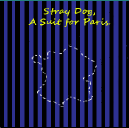
The background of the front page on the CD cover translates the first line in the song ‘You’re Pinstriped’. I wanted the song to relate to the CD cover as much as possible as it’s his first single and the first album he has made. I therefore put this into play by making the background of the first face into black and blue pinstripes. The colours are uni-sex and therefore can be targeted at any gender. This was necessary as I did not want to make the target audience specific I wanted it to be as wide spread as possible to allow my artist to get as much publicity as possible. The font used was Segoe script, bold at size 24. I made sure that I used the same bright yellow colour to contrast against the blue and black background. By using the same colour and type font on both ancillary texts, it acts as an advertising campaign for the artist.


As well as bringing across the idea of the song and the artist on the front page, I used a picture of the Eiffel Tower, a picture of the artist and his guitar and an outline of France on the front face. Each of these conventions brings across the personality of the artist. ‘A Suit for Paris’ is the name of the single, so I realised that an image of the Eiffel Tower would be appropriate as well as recognized widely from an audience point of view. Pictures of the artist was an idea that I had conformed to on the website, so thought that having him on the CD cover would also be suitable. This time, though, I changed the colour from the red edits on the website to a black and white for the CD cover as if the colours were red, it would not match with the rest of the cover.


What have you learned from audience feedback?

I made sure when I started my journey through audience feedback that I got a range of different people to hear from. I wanted different ages and different genders. In my class, I have a range of different genders, as well as having my parents (and older age range) and also Sam, who is 20.

The feedback I received was both positive and critical. My class mates and I each wrote down comments from each other after viewing music videos. This was an effective way for me to understand the comments as well as analyse how I would try and change things.

My class mates commented that they very much liked the fact that my artist was in a black and white polarized colour. This was very encouraging as I wanted to make my artist stand out as much as possible from my storyline. My audience also liked my use of a wide range of shots when my artist is used. This was helpful to know because I had tried to make sure that Sam’s shots were as entertaining as possible to ensure the audience would become enthralled and not lose focus, which conforms to Archer’s theory of creating a sense of rhythm.


A particular shot that was popular with my audience was one of Sam looking straight into the camera and singing his lines. This gives the audience insight into the artist’s emotions as when the viewer watches, they will staring into his eyes as he says ‘maybe we can make this change’. This convention follows the theory of Dyer as he suggests it creates a sense of intimacy between the audience and the star.


Another piece of particularly positive feedback was due to my use of repetition throughout the video. My audience liked the idea that this part linked with the words and to the song. Also the fact that it is sped up allows the audience to get an idea of the couple’s life over and over again. This is a common convention used in modern day music videos, so the fact that it was liked by my audience was reassuring.

Other feedback was also very constructive as the audience thought the richness of the colour on the couple’s scenes made the video seem more professional. Before I had edited this, the colours seemed slightly dim.

I also received some criticism. My audience thought that the song choice was not a brilliant one and the lyrics were hard to understand as they were quite quiet. It was hard for me to be able to change this at such a crucial point in the process, and at the start of the project I was let down by a colleague and therefore had a short amount of time to come up with a new song. Yet, I took on board the criticism from my audience and asked the artist to turn up the volume on the recording and re-send it to me. This was a success and did make a little bit of difference. If I could go back and make some changes, I would definitely have changed my song choice.

Another piece of criticism given to me from my audience was the fact that the storyline was not as clear as it possibly could be. The fact that the Paris ‘ticket’ was not shown and was slightly shabby made it un clear that the male was taking the female away for a while, which is the main point of the narrative. This was unfortunate and I realised now that I should probably have made an insert where the ‘ticket’ went, but regrettably did not have time. Continuity was also a criticism I obtained. The fact that when the car reverses off the drive there is no passenger in the passenger’s seat makes the video look less professional. I also unfortunately ran out of time to be able to re-film this part of the video.


The website audience feedback I received was pretty positive, but did have a few criticisms.
The first positive comment was on the ‘latest’ section of the homepage. My audience liked the fact that the news was straight in front of them when they logged onto the webpage. Each piece of information has a blue background and bright yellow writing and really stuck out to viewer and also conformed to the rest of the colour scheme on the website. I agree with this comment as this draws the audience’s eye straight to the middle of the page and entice them into reading more about the artist as well as searching through the rest of the website.

In addition to this, feedback such as suitably sized hyperlinks which allow the audience to search through the website as easily as possible.
Another positive point made by my audience was about the merchandise on the homepage, a lot of the feedback was based around the merchandise and how professional it looked.


Seeing as a lot of indie bands are putting out t-shirts with their faces and ‘tags’ on them, the convention really sticks to what is being released around this time. Also the fact that both the ‘latest’ and ‘merch’ sections were in scroll-bar boxes, according to feedback, makes the home page look edgy.
The title and logo at the top of the page were also a hit with the audience. They liked the fact that the artist had his own shape to be recognized for and though it was a good convention to use.

Some criticism that I found from my feedback started with the fact that there were no tour listings on the homepage. Yet, I did explain the fact that this information would be in the news section and that if the hyperlinks were used, they could find this out there. If I were to do the homepage again, I would ensure that there was more information on the tours and a specific link for them.
Another criticism that was made is that my buttons may have been a little too simple. There could be some sort of flash used when the cursor roles over the button, or it could have been a different shape. However, I was still pleased with the buttons that I made as I did not want to overcrowd the homepage and make it look trashy.


My digipack also received both positive feedback and some criticisms.
My audience liked the way that my digipack was laid out. The fact that you can open it from two sides and see the CD in the middle allowed them to be able to see the art around the main point (the CD). The front page was especially commented on as it connected with the song as well as having an unusual shape on the front (France), yet it still linked back to the song and gave the front face a personal feel.

Another good point of feedback I received was the fact that my audience liked the idea of thanking certain people on the inside of the cover. Comments were things such as ‘this makes it seem as though it’s really coming from the artist, not just the manufacturer’. This was very encouraging as seeing as though my artist is a solo; it means more for him to be as connected as possible with his target audience.


One piece criticism that I got from my audience was that the back of the cover, where the titles of the songs are, was a bit plain and I could have placed an image of an instrument, or even my artist, above the song titles. However, after looking at a few CD covers I will have to disagree with this comment as quite a lot of the covers I have seen have been simplistic on the back due to busy front pages.
My audience also thought that I could have made my CD holder a little better designed as that was also quite basic. This could have been changed as two simple faces inside and outside on the same slide looks a little unprofessional, however I am still pleased with the overall outcome.


How did you use new media technologies in the construction and research, planning and evaluation stages?

As I was put back about a month due to having to start again after my partner left school, I made sure that researching for my artist was made much simpler. To get the permission from the artist that I chose due to friendship, I used emailing via hotmail as a form of media. This allowed me to let my artist know any details he would like as well as enabling me to get the permission from him as soon as possible for the rest of the project.

I also used Youtube, Facebook and TV music channels as other means of media. Youtube and music channels allowed me to look through a variety of different music videos to try and get inspiration and ideas to add into my video. For my research I looked through music videos that I knew well and analysed them to realise Dyer’s theory of stardom. Facebook was another way for me to get in touch with my artist. I needed to make sure that I contacted him in more ways than one to ensure that I would definitely get a reply in the near future. This saved a lot of time as it worked out that he got the Facebook message faster than the email to his hotmail account. Without the social networking site it may have taken a lot longer to get in contact with him, so it saved a lot of time.


During the editing process I used a lot of un-natural colouring. The only way that I was able to make this happen was through Adobe Premiere Pro, another form of media. I dragged threshold, colour balance and brightness and contrast onto various different shots to enhance them. Without this form of media my video would not have been able to develop the scenes and the audience would not have got the overall effect that I really wanted to make.


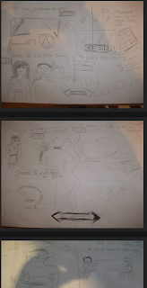
Also throughout the construction stages of my storyboard, I used a lot of still pictures from a digital camera, another source of media technology. Without these pictures I would not have been able to upload drawings of what I presumed the storyline would look like and planning would not have been as simple for me. Making the storyline animated as I uploaded my coursework gives the audience a much better idea of what the eventual piece may look like.


During the construction stage of my website, I used the programme Dreamweaver. This software allowed me to upload pictures, make a table to lay out all the information I wanted to insert and also keep checking on the internet of what it would look like to the audience. The software also allowed me to move my text and images around on the page, this was really helpful as it created a structure for the website and made it a lot easier to create. Dreamweaver also allowed me to create hyperlinks for different pages, even though this was not expected, which makes the website more interesting for the viewer.


I also used Photoshop Pro throughout the construction stages of my website. Using this programme meant that I was able to edit pictures of the artist to make them more interesting as well as look more indie and modern. Creating text on Photoshop was also very helpful as without it I would have had to use a programme such as ‘paint’ and it could have looked less professional as well as taking up more time.

I also used Photoshop on my CD cover. This was great as I was able to set a layout of three pages for the front and three for the back, all spaced out and sized the same to look professional and clear for the consumers. Being able to create text as well as import images and edit colours all in one piece of software made it very simple to change any ideas I did not like, experiment with different designs and stick to the colour scheme I had chosen.

Whilst writing my evaluation and updates on my coursework, I used www.blogspot.com. I could show my progress on all three ancillary texts through this media technology as it is simple to upload photos and videos and write information that is necessary to the project. It is a great way for the audience to follow the development of my final piece. As the site allows me to upload screen shots and digital images, the audience see what I have been doing as well as reading more detail about it, this will give them a better idea of exactly what the final project will look like. Embedding videos is also a great way to animate texts such as my digipack to ensure the audience know exactly how it will look. I can also embed music videos from Youtube such as Paramore and Forever the Sickest Kids which adds to the text when I am analysing the videos or talking about a particular convention from it on my blog.

Blogspot is also very handy for ensuring that all of my work is up to date as well as keeping it in time sequence. If I was to hand write all of my coursework, it may be harder to understand and edit as well as keep up to date with.

Friday 26 November 2010

FINAL DRAFTS.

Final Video


Final CD draft

I quite liked the first idea that I had with my CD cover, yet realised that the stripes on the front of the cover were not pinstripes, which is what I had wanted to go for originally to match with the first line of the song 'You're pinstriped...'. The outline of France on the cover also did not stand out particularly well, so I made sure that I put a few more white dashed lines on the outline. On the back and inside there weren't particularly any changes that I wanted to make as I was pretty pleased with the end result. The only change that was made was the picture of Sam on the front side left as I had a change in artists. I wanted it to be simple, yet have colours that were edgy and stood out a bit.

Front Cover


Back side middle


Back side left


Inside right


CD Placement


Inside left


Website


I constructed my website on Dreamweaver. I firstly designed the tables in order for my images, text and scroll-boxes to be displayed professionally. I needed to make sure that I inserted the two text boxes into the 'code' area of Dreamweaver to create small scroll-down bars which would look interesting and different.


I edited all of my pictures in Paint Shop Pro and then had to change the images that had been edited back into JPEG's to ensure that they could be inserted into Dreamweaver and onto the website. I also did all of my text on Paint Shop Pro and these were cut and inserted in the same way.


Also when adding my video I had to ensure that I converted the file to 'SWF' format as if this is had not been done, Dreamweaver would not have presented it correctly.


By making sure that I used all of the same colours on my website as I did on my CD cover, the two texts would link together and create a more professional advertising campaign.

Wednesday 17 November 2010

First Draft of Music Video


There are a few things that I'm not overly pleased with in my first draft, but have made a list of what to do in my second draft to ensure that the video runs smoother and is more to my liking as well as the audience's:

- Possibly have the lyrics appearing in some of the scenes, as the artist cannot be heard at some points.

There are points in the song that Paul can't be heard, this could be down to a number of things, like his Sheffield accent or the fact that it may have been a bad recording. But, I have to live with this and work around it. This therefore means that I could possibly have some of the most predominant words, that tell the story most, written into the video. It could be possible to have them over some scenes, or over Paul miming. Yet, I think the best idea would probably be to give the words their own 2 second slot. I.e. have a black background and fade them in and out or make them appear quickly like a burst of lyrics. The idea, I am not sure of yet, but I think this is still a good idea and could be part of the second draft.

- Possibly have an intro, rather than an outro.

One of the members of my audience said that not many music videos go straight into the song, which I completely agree with. This is why I came up with the idea of changing my artists name and title of the song from the outro, to the intro. This way the audience will get a start to the song rather than just going straight into it as at the start most people don't concentrate fully anyway and need to get into it before hand.

- Get more shots of Paul, more extreme close-ups and more shots of the guitar and him miming the lyrics.

Seeing as I didn't think Paul would be in it as much, I don't have enough variety of his shots. This is why I will need to get him to come down to Nottingham again and get more close-ups of his face when he is singing the lyrics as well as him just singing the lyrics from a mid-shot and more shots of the guitar. This will give a lot more variety and make the video more interesting for a viewer's eye.

- Have the colour of the scenes coming in slowly, rather than straight away.

In my first draft, the couple go from being in black and white (as they have a dull, boring, life) straight into colour. I perhaps think, looking back, that I should change this to make the colour of the couple slowly come into play rather than just going straight into it. This will give a feel of the couple getting happier as time goes on and as things slowly change.

- Think about colour for Paul, possibly sketched or black and white?

Having the couple in black and white and then in colour means that Paul doesn't particularly stand out as he is just in a normal colour. This is why I think that he should possibly be in a sort of cartoon/sketched colour to ensure that he stands out as the artist and it can be seen that he is just singing about the couple and does not really have any relation to the two people, aside from the fact that he is singing about them and possibly telling a story of his life, but with different people.

- Longer part for the smiling bit.

There are a few bits in the video that are not really long enough for the viewer to understand. For example, there is a part when the couple are looking in the mirror together (which contrasts the man looking in the mirror on his own) and laughing. Yet, it is only about 2 seconds long and to get a real feel of the emotions, I think in the second draft it must be longer.

- Sort out continuity.

There are two continuity errors in my first draft which the audience also noticed. This therefore definitely needs to be changed for the second draft to ensure that the video flows and looks professional.

- More of a close-up on the Paris tickets; make it more obvious that he is taking her to Paris.

The Paris tickets in my first draft cannot be seen particularly well which gives off slight confusion for the audience. I need to ensure that the Paris tickets are seen properly to the audience realises the husband is changing their lives, being spontaneous, and taking her away to Paris.

- Picture of the Eiffel Tower on the tickets? Maybe a piece of paper that Alex opens to see writing or a picture?

The Paris tickets could be made even more obvious by a picture of the Eiffel Tower or maybe a letter saying that the woman is going away with her husband, or perhaps just two fully made tickets to make it clear to the audience what exactly she is receiving.

- Longer part for reversing off the drive, make sure the pieces fit together better.

The shot for the car reversing off the drive does not particularly merge with the shot of the car driving off, which means that I will need to re-shoot this and ensure that the two shots can merge together and it is long enough to be able to look professional.

- Longer smiling part in the car, ensure that it is obvious they are smiling.

This is another part of my unhappiness with a few shots in the first draft. When the couple are in the car and I have a shot from the back seat of them both looking at each other and smiling, it is not particularly clear. A member of my audience didn't realise that they were going away together and this therefore means that I need to ensure the message of the video is clear, especially in this part.

- Make writing on intro/outro clearer.

The writing in the outro (soon to be the intro) is not clear enough to be able to read properly. This is why I need to ensure that I use a different font and different colour of writing to make sure there is no confusion for the audience.

Monday 1 November 2010

Filming Diary!

Unfortunately, my filming schedule was not stuck to precisely. There was a lot of changing of dates due to either bad weather or double booking. This therefore meant that I was a little behind on my filming by the time everything got done. But I have now started and am getting on quite successfully.

Paul's shoot
A few days behind schedule, but Paul finally came down to Nottingham to get his filming done. I knew that I would only need one shoot for Paul's part of the music video as he does not play a massive part in the story and I would rather concentrate on Alex and how she feels within the video rather than how Paul is. After setting up all the equipment and getting Paul in the right place, I realised that the wall he was sitting in front of in my lounge wasn't going to work. This therefore meant that we would have to swap him to a different wall to allow me to get further long-shots and move the camera around slightly more within his scenes. I also decided that having the white sheet behind him was not going to work either. This was due to the fact that I did not have anywhere to pin it up, and as the walls were a beige colour anyway, it didn't really matter all that much.
I did a variety of shots, as said before, to ensure that I had a range to edit in and out from Alex's scenes. This also allows me to have slightly more footage than I originally planned to make me more comfortable when it comes to editing as I have a lot to choose from. There are also a few pieces of film that I didn't necessarily plan out just to add to the storyline a bit more.
I am pleased with the lighting on Paul's shoot and he has also added to the song slightly. He has added more instruments and a slightly longer introduction as well as layered vocals.
I think I probably should have planned out the filming slightly better and also been completely ready and set up before he got to the shoot as I was slightly mixed up and wasted a bit of time. Yet, in the end I am pleased with the shots I got and am hoping that they go nicely with Alex's scenes too.

Alex and Sam's first shoot.
The first shoot held with Sam and Alex went quite well. Even though sometimes the actors went off track, we got on with it. The first few scenes went great and then a few scenes were changed, i.e. the kitchen scene where the couple sit together, looking glum. This was changed to the living room as Sam thought it would be a better idea to get it in there as it is more of a normal place for a couple to be spending their time. The day was also a bit glum and towards the end I was realising that I was taping over some of the filming that I had already done. This meant we had to go back a second time and do about 3 scenes again. This took up a lot of time and was not great for the day. We got the last shots and finished the day, but I realised after everyone had left, I'd taped over some of the filming again. This meant the filming I had done was blurry and jumpy. This is very irritating as I now need to go back and do it again. I also did not do a few of the last scenes as they were outside and it was raining quite heavily. All in all, the shoot wasn't great, but I got about 70% of the filming done, which puts me in good stead.

Alex and Sam's second filming
The second day of shooting for Sam and Alex's part of the music video went much smoother. We got most of the filming done in around an hour and a half as I knew exactly what I wanted now and knew how it had to be done and where it was going to happen. We got all of the shots finished that had been ruined in the previous day of filming and got everything done, plus a few more shots that I had forgotten or hadn't done previously. There are a few continuity errors in my first draft as we changed locations and some of the shots that hadn't been ruined were not filmed again. But in the final draft I will make sure that these shots are different and the continuity has no errors.

Alex and Sam's third filming
The final filming with Sam and Alex has been done. This was only needed due to the continuity errors in the first draft. These errors could definitely not have stayed and therefore needed to be shot again. Most of the filming was done correctly and I got a few more bits done, as well as the car reversing out of the drive again as I wasn't overly happy with the first take.
Yet, unfortunately, part of the shoot was filmed over again. I hadn't realised this until after the shoot and until it was too late. I now have to make the decision as to whether or not I will include this shot in the video or not, it is not necessarily a massive part of the film yet could be quite helpful to understand the video more.

Sam's filming

Due to unfortunate events, Paul is not able to star in the music video any longer. This is a real shame and has caused quite a lot of stress and a slight rise in production time, yet I asked Sam to step in for me as the artist and he was more than willing to help.
Seeing as the audience had said that the video did not have enough variety of shots when the artist was on the screen, I made sure when I started filming with Sam that I had a lot of different shots, high angle and low angle as well as close ups, mid shots and long shots.
I also asked Sam to mime the words a lot more than Paul did as in parts the words are hard to understand, yet if the lip syncing is done to a good standard, the lyrics might not be as confusing.
I also swapped rooms for the artist's filming. This was due to the background in the room, I was not happy with the first background as it had a lining of wallpaper through the middle, rather than being completely plain as I had first planned. The room I used on the final draft is completely blank and white.


Monday 12 July 2010

Research!


As can be seen from this video in particular, not all videos necessarily need a star.
Arctic Monkey’s completely prove this theory. The fact that throughout the entire video, not one member of the band is seen portrays the idea that the song is about the music and the story behind the lyrics rather than all about the band and how famous they want to get by showing themselves and nothing else.
The Arctic Monkeys have been around for years now, and even though a few of their videos show themselves performing, most of their songs show meaning and a story which is normally dark and mysterious. This is a great way of allowing the audience to listen to the music properly to take it in and understand the lyrics with the story that is shown rather than by just looking straight at the band.
Personally, this makes me enjoy the music that bit more. It shows that thought has actually been put into the production of the video, rather than concentrating on how the band look and the effect that look has on the audience.


In some ways, the artist is important. Watching a band play on screen as well as having a background story definitely has an immediate effect on the audience. By being able to see each stage of the story clearly, and then bouncing back to the artist actually puts more emphasis on the emotion of the video. For example, Paramore – Misery Business is an angry, bitchy, video which is portrayed a large percentage of the time through the performance of the lead singer, Hayley Williams.


Directors Research


Shane C. Drake
Shane is an American music video director from California. He has directed videos for many different genres of music and many different artists, for example:
Hawthorne Heights, Timbaland, Trivium, Panic at the Disco, Flo Rida, Red Jumpsuit Apparatus and many more.

Shane has directed more than 50 music videos in his career and co-produced three films. He owns Red Van Pictures which is a Los Angeles Production Company. He first started off as an editor and then a cinematographer with such bands as The Deftones and Thursday.

One of the videos that Drake recently made in 2008 was 'Woah Oh!' - Forever the Sickest Kids:


Most of the sets that Drake uses are unique and interesting. This gives me inspiration to make my video different and non-commercial. Shane also uses the band in his videos quite a lot, which we will probably not be doing, but he they are portrayed in a very quirky, interesting way.

For example, in the Forever the Sickest Kids video, Drake has chosen an airport with what looks like a real aeroplane in the background to make it look more interesting and gives the audience a reason to watch on as they wonder why it is there. The car racing is also another great eye-catching technique that gives the audience something else to concentrate on.

The fast paced cars contrasted with the faced paced shots of the band work very well together as it gives a feel of the band and how hyper-active and crazy they are with their music and videos that they want to/have made.

Vincent Morisset


Another great music video director is Vincent Morisset. Seeing as the music I am portraying through my video is acoustic and indie, I thought I would try and find a director that created a music video for a band similar to this category.

Vincent comes from Montreal and was one of the first guinea pigs at UQAM's new media program ten years ago. He has done many videos for bands such as Arcade Fire and Colorblind Clyde. But the one band that really relates to my type of music is City and Colour. There is not actually a video on YouTube for this song, the director took a completely different route and made a sort of interactive game in which the viewer sees the life of one man in a variety of different ways. By being able to zoom in and out, Vincent Morisset gives the audience a chance to re-shape boundaries. It sort of like being in a plaster-scene world. Brilliant. Here is the link:

http://www.cityandcolour.ca/sleepingsickness/sleep.html


Research into genres
I will be researching two different genre videos. At the end, I will explain the differences.
Crazy In Love - Beyonce Ft. Jay Z
http://www.youtube.com/watch?v=G6HPJJjqvG0

The first sequence shots in this video are fast-paced, sexy and exciting all in one. Seeing as Beyonce has been in a best-selling R&B artist since 2005 after splitting with Destiny's Child and realising her first solo album 'B-day' in 2006 she knows her way around the camera and from the first time she appears on the camera she gives a hot and sexy feel to the video in the first 10 seconds.


Yet, before we see Beyonce, we see her 'feature' for the song, Jay Z. It seems that he is sitting in the car that is speeding towards Beyonce and closing up on her body and also taking a mid-shot of her to listen to her say 'You ready?'.


The edit then goes straight back to Jay Z to watch his head nod in agreement.
The sexiness then steps in once again as the camera shows a long shot of Beyonce walking towards it and taking her hair out to swing it around in a typically seductive way.


The camera then puts Beyonce walking in slow motion towards the camera to again add to the provocativeness of the music video. This goes alongside another slow motion shot of Beyonce's sexy red stilettos and then up to her curvaceous, voluptuous bum.
Even more provocativeness is injected into the video straight after another very quick shot of Jay Z adjusting his cap by then shooting the entire of Beyonce's body, including her very long legs with such tiny shorts on.


After that shot, we see a few more 2 second clips of Jay Z rapping for the start of the song and, in a non-obvious way, is seems that he is showing his gratitude for Beyonce's amazing body.
The video then really kicks off as Beyonce starts her dance routine and the camera mixes long-shots, mid-shots and close-ups of her body and the way she is dancing. The camera adds to the fast-paced, erotic dancing with around one second edits.


We really get the idea of how seductive Beyonce really wants to be in this video half way through the video when the camera takes four slow motion shots of her in different poses to show how sexy she is and then cuts straight back to more hot shots of her doing the rest of her dance routine.


The video then cuts to another location with Beyonce dancing. In this location she seems to be on the roof of a building in New York. To represent her fame and fortune, bright flashing lights are set up around her to represent paparazzi. The cameras move around her and the edits are, again, fast-paced and cut very short to keep the video interesting and exciting.
There is even a shot of what looks like a camera opening its lenses.


The video then again changes to its third location in a what looks like a back street. This time, Beyonce has five women to dance with her to make the video even more sexy and seductive as they all shake their bum's in what is said to be Beyonce's 'signature' thing to do.


The camera then uses close-ups and medium shots of Beyonce and her girl dancers and they slam onto walls and walk seductively towards the camera, teasing the audience.
The camera then cuts to Beyonce trapped in a car. It shows her sweating and slightly distressed. The camera in the right hand corner of the car sees Beyonce as she moves around in the car as if she is trying to get out and stares into it as if she is a damsel in distress pleading with it. This adds to the tension of the video and makes the audience want to watch on to see how the story turns out. The short cuts, again, add to the fast pace of the music video.

A cut is then used to move outside of the car where we see the shadowy figure of Jay Z and then cuts back to Beyonce as she is oblivious to the fact that he is just a few feet away from her trapped in the car that can be seen in the long-shot behind him. We then see a close-up shot of Jay Z's lighter being flicked open as the fire shoots out and as this happens, the camera returns to a close up of Beyonce looking to her left as though she heard the sound of the lighter. This really adds to the story through the song.


The camera then cuts back to a close-up slow motion shot of the lighter dropping to the floor and setting the petrol that seems to run from the car to Jay Z's feet on fire. The camera then follows the fire down the line of petrol slowly with back and forth shots of Beyonce still frantically moving around in the locked car. Another long-shot is then taken of the fire speeding up down the line of petrol to the car that the audience would assume Beyonce was inside of, adding even more tension into the story of the song.


The car then blows up as the line of petrol gets to the car, it blows up and the light from the fire and explosion light the entire screen of the video as Jay Z stands there in awe with his back to it.
7 seconds of very quick edits from Beyonce inside the car frantic and rolling around to Jay Z outside of the car with his back to it is then used. This adds more suspense to the video as anything could happen in the story from this point.


When the sequence ends the camera now concentrates on a mid-shot of Jay Z with amazingly bright fire behind him as he sings a few lines. The camera then cuts after about 5 seconds to one mid-shot of the front of his face and then cuts to another mid-shot of his profile.


Straight after these shots, Beyonce walks back into the scene and this is seen through a low long-shot. A series of long-shots, mid-shots and close ups are then used on the pair as Beyonce walks around Jay Z and gets up-close and personal with him. This adds sexual tension to the couple and the video as well as injecting that bit more of provocativeness from Beyonce in her tiny 'onesy'.


Two-shots in the video are then used very frequently as Jay-Z raps for his longest part in the song. At one point there is a two-shot from a low angle which makes both the artists look powerful and as though they own the video and the story. Between the twos-hots there are also close-ups and mid-shots of Jay-Z used as this part of the song concentrates on him mostly with Beyonce as his partner, rather than the other way round as it has been prior to this section.


A close up of Beyonce's face as she bows down and breathes in and out staring into the camera is then used to catch the audience's eye and brings them further into the life and story behind the song. A cut to Jay-Z's back facing the ruins of the hot explosion on the car is then used which eventually cuts back to Beyonce looking hot and sexy. This is a great contrast between the two things. A real, blazing fire compared to an irresistibly beautiful woman injects even more erotic fantasies into the video.


Even more two-shots of the pair in the deserted street in front of the blazing fire are then used as Jay-Z carries on with his part of the song. Making these edits around 2 seconds long makes the video fast-paced and exciting to see what is going to happen at the end and what shot the song will finish with.


The video then cuts to another slow-motion shot of Beyonce kneeling on the floor with her body out, again, staring into the camera with such intensity to keep the audience glued to her eyes as she is glued to the camera.


This shot then fades out to another shot of Beyonce. This time she wears jeans and looks a lot more casual as she takes slow-motion steps towards a fire hydrant in her huge heels and small crop-top. The street is dimly lit by lamposts which adds to the tension of what she is going to do and also the sexiness of her walk. She then raises her leg to to kick the fire hydrant and the camera cuts quickly to just her foot and the end of her leg kicking off the cap and letting the water burst out profusely.


Two-shots from the previous sequences are then used of Jay-Z and Beyonce but quickly cut back to Beyonce on her own, with her arms in the air, dancing underneath the 'rain' of the fire hydrant. She looks like more of a sexy silhouette which, again, adds to the heat of the video.


A sequence of cuts is then used within the scene of Beyonce under the water from the fire hydrant. Close-ups of her running her hands all over her hair, body, face mixed with fast cuts of quick, jolting, dance moves makes this scene like a steamy fantasy.

A cut within this sequence is then used to move to yet another location and another outfit. As Beyonce stands next to a huge fan in her fluorescent orange outfit, the audience is captured yet again. Yet, at this point, the video is still cutting from the new location back to the water hydrant scene just as it did before hand in the video, i.e. from two shots to water hydrants.

The cuts contrast between a wet, dark Beyonce to a dry bright and colourful Beyonce which injects even more life into the sequence.

A shot of Beyonce walking forward looking extra beautiful with five dancers in the same extravagant colours walking the opposite way to get behind her is then used to introduce the audience to the scene. A series of fast cuts between long-shots, mid-shots and close ups are used on Beyonce and her backing dancers to ensure that all the dancing and provocativeness is packed into the scene. The video then, again, cuts back to the fire hydrant scene but straight back to the fast cuts on in front of the huge fan.

The video ends with Beyonce and her girls walking towards the fan and back out into the distance and then finally back to the scene in which she is in the car with just a close-up of her face staring into the camera to finish it off with a sexy bang.


Ending slowly is great for this video as seeing as it has been so fast-paced it leaves the audience at the end calmly, yet still out of breath.

Tuesday 29 June 2010

Research!

What is Pop?

According to Wikipedia:

'Pop music (a term that originally derives from an abbreviation of "popular") is usually understood to be commercially recorded music, often oriented towards a youth market, usually consisting of relatively short and simple love songs and utilizing technological innovations to produce new variations on existing themes. Pop music has absorbed influences from most other forms of popular music, but as a genre is particularly associated with the rock and roll and later rock style.'

The definition of 'Pop Music' has become, from a personal point of view, completely distorted. Whenever I think of 'Pop', what comes into my head is Steps, SClub7 or Spice Girls. I think this is where the actual term derived from, and therefore the music world seems to have changed somewhat.

There are now too many genre's in the music business to actually name unless you are completely up-to-date with the latest of all music types.

Yet, I do know the difference between mainstream and non-mainstream.

Textual analysis of a music video


I am analysing ‘Only Exception’ by the band ‘Paramore’ from Franklin, Tennessee and directed by Brandon Chesbro.
Paramore can’t really be put into a genre, but if they were, I’d say they were Rock/Indie. They use heavy guitars in around 70% of their songs on each of their three albums, portraying the idea that they want to get across their ‘Rock’, serious and hard side of their music. Yet, at the same time they have the other 30% of their songs as emotional, soft rock, usually singing about love and heartache.
The video definitely brings across their Indie side. Due to the fact that they heavily use the acoustic guitar within the song it can be strongly portrayed within this genre.
Also, the video definitely realises the emotional and well-thought out lyrics and story behind the song. It shows a woman walking through life, going through guys, and finally actually finding the one she wants after not caring about love or wanting to be involved with a relationship that she knows is going to end badly. The video goes through the lyrics step by step to allow the audience to relate exactly to what message the band are trying to put across.
The lyrics are illustrated within the first line.
‘When I was younger I saw my daddy cry, and curse at the wind.’ Straight away we see Hayley Williams (the lead singer of the band) walk into a room and hug her father. This really brings across the emotion of the closeness she has to her dad and it can be seen that she has been affected by how he has been hurt in his life.
‘He broke his own heart and I watched, as he tried to re-assemble it.’ The audience then watches, through this line, Hayley have a conversation with her father. It looks as though they are smiling and having a sweet conversation about something they both knew well. Also when Hayley picks up the picture, it pushes forth questions of whom it could be, and why would she want to keep it? This keeps the audience watching. After yet again another cuddle, Hayley walks out of the room to the line:
‘And my mama swore that she would, never let herself forget.’ We now see Hayley in what looks like her own bedroom and find out exactly what the picture was. It was her father and mother together, and smiling. This then puts forth more questions for the audience, has her mother died? Have her parents split up?
‘And that was the day that I promised, I’d never sing of love if it does not exist.’ During this line we get a head shot of Hayley. It shows her emotion and the distress she feels whilst looking at the photo of her mother and father that she has just slid into the edge of her bedroom mirror. It can be seen in her face that she has been affected by whatever has happened between them and as the picture has been put out of focus and concentrated on Hayley. Yet, after we see the hurt in her face, the camera then goes out of focus on Hayley’s face and back onto the picture, which places that bit more emotion into the video as we go back to the main source of her pain.
‘Darling, you are the only exception, you are the only exception.’ From the close-up of the photo and the mirror, the camera fades out and goes into another close-up of Hayley’s face. This time she looks dressed-up and done-up, yet still miserable. But as the camera zooms out of Hayley’s face, we see her background. Hundreds of heart-shaped love notes, a pink/orange/red background that lights up around her small body in the middle of the huge floor. This line really portrays the fact that she has now changed. After all of her problems with her parents, she is able to find someone that is an exception to the rule.
‘You are the only exception, you are the only exception.’ After the long shot of Hayley’s body the camera then zooms back to her, with this line in toe. Getting the close up of Hayley’s face intensifies the video even further as the audience can see right into the eyes of the loved, yet lonely young woman. Her eyes are so dark that the audience is immediately pulled in.
‘Well maybe I know, somewhere, deep in my soul that love never lasts.' Before this line, the video straight cuts to the entire band sitting onto a stage that is very simply set out. It shows band members sitting on amps and gig boxes, as well as a very minimal drum kit. This proves the idea that the band didn’t want to concentrate on them, they may want to have been shown, but the story is what is concentrated on throughout the video. Also the fact that Hayley sits on the floor, slightly curled up, portrays more emotion to how she is feeling as the rest of the band are above her, yet the spotlight still concentrates on her and her only.
This line of the song lasts through a number of shots and at the last bit of the line, the camera cuts back to Hayley in her room again. This time we get a close-up of jewellery to portray her gender as well as then getting a close-up of her putting lip-stick on to represent this further. Yet, we then get a mid-shot of Hayley, looking down, miserable and as though she is trying to shake off the bad things that have happened in her past.
‘We’ve got to find other ways, to make it alone, or keep a straight face.’ The audience then watches as Hayley walks out of her room and into another room full of a girl’s favourite things, clothes. She walks past and touches all of the inanimate objects, it doesn’t make her happy. Her face stays miserable, the same as it always has been, because no matter how much she owns or can buy, she will never have love.
‘And I’ve always lived like this, keeping it comfortable...Distance.' We then see Hayley walk towards the camera, as it tilts upwards to see her made up face and hair. We then watch as she walks into what is set out as a restaurant. She walks to a table of two, with a man sitting on the other side. We then see a mid-shot of Hayley, smiling towards the man sitting opposite her. As the camera then cuts to a medium-long shot of Hayley sitting at the table, we see a line of men waiting for her and also the first of her ‘dates’ walk away abruptly as the next one pushes him to move. This exposes the idea that she can have anyone she wants, really. It’s not that she is necessarily un-loveable; she just makes herself that way due to the trauma she went through with her parents and past lovers.
‘And up until now I had sworn to myself that I’m content, with loneliness.’ The camera then uses another close-up on Hayley’s face looking confused and disorientated. Yet, we get an over-shoulder shot of another of her ‘dates’ as they look through the menu together. The next shot then again shows a close-up of another ‘date’ trying to shove the guy in front of him out of the way so he can get his turn with the gorgeous young woman. But, again, we get a close-up of Hayley’s face looking confused and a little upset that none of her ‘dates’ were what she wanted, none of them worked for her. The cuts from one man to another then give a very emotional touch to the video as it can be seen that she has gone through so many relationships and they have all ended badly. This leaves the audience feeling sorry for and maybe even being able to relate with Hayley.
‘Because none of it was ever worth the risk.’ This lyric comes across just as Hayley gets up out of her seats and walks away from all of the guys that she could possibly have, yet doesn’t want due to them not being right for her. This brings across a lot of emotion as she is still miserable, walking away from people should could have cared about yet can’t anymore. She pushes through the men with her head down and then comes out the other side with a black coat on. This represents her pushing through her past and coming out with something different.
‘You are the only exception, you are the only exception.’ Hayley then walks into a different room. A room set out as a church, with all of her band mates sitting on benches wearing white whilst she contrasts by wearing a full black coat. The camera then straight cuts to a mid-shot of the drums being played and then zooms out again to the rest of the band with Hayley still on the floor with the spotlight still fully on her. Another straight cut, then, back to the ‘church’ where Hayley sits down on the front right of the left row next to a band mate. Straight after, we go back to a band member strumming an acoustic guitar, to portray the fact that they are still trying to show themselves as well as running a story at the same time.
‘You are the only exception, you are the only exception.’ On the first beat of this line we see a bride walk through the doors of the church, completely exposed with sunlight so as not to see her face. When the bride walks in, everyone turns round to look at her and see her shining as a new bride, aside from Hayley. The camera pans right towards Hayley, to show her miserable, lonely face as the bride walks down the aisle.
‘You are the only exception, you are the only exception.’ The video then edits straight back to Hayley lying down on the love letters once again. This portrays the fact that that is where she wants to be...Surrounded by love, not surrounded by someone else in love.
‘Instrumental’. There is then a close-up of Hayley’s miserable, unloved face which then cuts to a long-shot of Hayley running out of the church, into the light as she cannot take the heartache any longer. Yet another cut is brought to the video as a mid-shot of the guitarist is seen as well as a pan to the right of the drummer, Hayley and another guitarist and then another pan to the left to contrast of just Hayley’s head and part of the drummer. The instruments then carry on as there is a cut to a completely different set that has not yet been seen in the video. We watch as a high-angle shot of Hayley as the camera pans right in slow motion.

Industry
Seeing as my artist is unsigned and started out just a year ago, there is not much research into him that can be done.
The type of record label that Paul would fit into, though, is one that has taken bands in that haven't really been known in the past but have played a few gigs and won't be utterly main stream.

Target Audience

I decided to do a questionnaire for my target audience research:
(answers to come)

What type of music do you like best?

R’n’B

Rock

Indie

Pop

How often do you watch music channels?

Everyday

Every week

Not often

Never

Why do you watch them?

Because you like the music

Recommendations

To see the story unfold

You don't

Do you like music videos when you see the artist or when you don’t?

See the artist

Don’t see the artist

Not fussed

What type of Storyline do you like?

Happy

Sad

Deep

Funny

Do you like cliff hangers in music videos or not?

Yes

No

How many main characters would you expect to see?

1

2

3

4

5

What theme do you prefer in music videos?

Storyline

Dancing

Comedy

Other


CD Cover Research


Katy Perry sells millions of albums, and that is why I've chosen to analyse her CD cover. Her music is very mainstream and therefore seen by millions of people across the world.


As can be seen from the cover of 'One of the Boys', Katy likes her music and attitude towards her job to be bright, fun and silly.Candy floss pinks and cherry reds are used all over the cover to show her girly, fun side and to also contradict the albums title. Seeing as Katy is surrounded by pink Pelicans and baby pink 'boom boxes' situated next to small colourful flowers, it is obvious that whatever is inside the album is going to be girly, happy and really easy to dance to, which it is. Yet, Katy's face contradicts her surroundings just as her album's title does. She seems serious and sexy which is much more mature than the set-up that has been made around her.


It is quite obvious as well from the picture of the young woman that the lighting is from a studio. This could possibly represent the fact that the album is produced in a fake way. The songs are 'plastic' and do not hold much emotional reasoning. Most of her songs are silly and quirky, and the album cover definitely shoes this with it's random props and Katy's 'cute' clothing.The text saying 'Katy Perry' also seems to represent some type of candy. As the font is swirly and covered in a cherry red colour with a creamy white outline, it could remind the audience of strawberry laces, which seems to be the exact idea that Katy was going for. The album cover is probably targeted at young party people that are waiting for a good time. It will no doubt be in the age range of 12-22.


Mumford and Sons are a pretty new band and have brought out two albums. This is their second.

Image
The image on the front of the cover is quirky and unique. I have never seen anything like this done before which creates an eye-catching idea. The fact that the four band members stand casually in shop window is a very initiative technique. As they stand with their instruments, it is easy to see by looking closely what type of music they are trying to sell.
The lighting is dim, and the buildings around the one in which the band members are posing in are dark and forgetful. Yet, the fact that the four members of the band stand in the window of a shop that is gleaming white and really stands out from the crowd gives it a reason for the audience to take a second glance. As the font black allows it to contrast against the bright grey pavement and also stand out beneath the band.
Font
The font is a mature and bold, helping the band to sell the type of music they play and also the way they want to come across. By having this type of font it shows that they probably won't be a pop group or an r'n'b group as this genre can be seen by simplicity rather than something like Katy Perry which can be sold by her creativeness.
Layout
The layout is pretty simplistic. There are no huge ideas or different things going on. There is two things that the cover concentrates on, the band members and where the font is placed. This is pretty familiar in this type of genre as simplicity is key in the indie/rock world.

CD Cover
I decided that my CD cover would be simple. Seeing as the song, video and artist are pretty casual and simple, I realised that if I went too far with the CD cover, it would give the audience a completely different idea of what Paul is really like.
I also decided that the cover would represent the album title's lyrics. Seeing as the album title is 'A Suit for Paris', I would need something that represented Paris as well as a couple of the lyrics in the song like 'You're Pinstriped', being the reason for the pinstriped background. Also I wanted a picture of Paul and the 'thankyou's' on the same side of the CD cover as it would look personal and shout out to the buyers as Paul Howe being a caring and passionate artist.
Here is the CD Cover:


Here is the inside cover: