In real music videos, there are several different forms and conventions that are used to ensure the audience is kept gripped and entertained throughout the viewing. These are such things as repetition, fast cuts, a variety of different shots, a good storyline and a good performance. I wanted to make sure I got all of things into my music video to try and make it as professional as possible. I have followed these conventions due to several different theorists' views, these are; Richard Dyer with representation and Roy Shuker with a connection to the audience.
I edited the artist into a black and white cartoon colour, threshold, which I had wanted to create from the start. I did want edit my artist into a colourful cartoon but thought that it would look more ‘indie’, which is the genre of my song, if it was in a simple black and white.The final black and white colours portray the idea of the song and the artist himself. As the song is quite mellow and gloomy, black and white matches the feeling that the artist is trying to put across. The convention that I was following here was to match the way the video looks to the type of song it was, this would bring across originality and also connect the audience to the artist, as Roy Shuker suggests in his theory.
Another convention that I used was to use a variety of shots of my artist from different angles. Including close-ups, long shots and mid-shots. The close up of his face as he moves up slowly to stare into the camera and sing the line ‘maybe we can make this change’ shows the emotion as he sings for the couple to try and make their situation change. As he is looking straight into the camera for this close-up shot, the audience will feel as though they are connecting with the artist, also used to follow the theory of Roy Shuker.
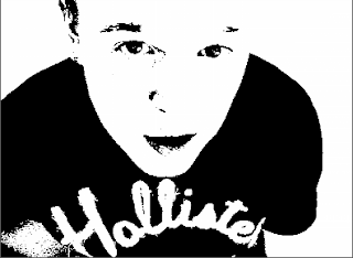

Fast cuts, according to Goodwin, are another current convention used in music videos. Throughout the scenes of the artist playing his guitar to the song, I used a lot of quick cuts to different angles of him. This happens quite a lot in the video, especially the first time that Sam (my artist) is seen. He sings one line, yet there are four cuts from a mid-shot to long-shot, to a close-up of his face and a close-up of the guitar being played. This allows the audience to keep up the exciting intensity of the video as well as creating a sense of pace. This is a common occurrence in modern day indie music videos, so using this gives it that professional feel.
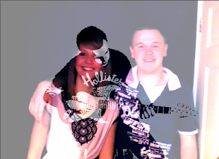
I also ensured that I used well lit scenes during the filming of my music video, yet another convention that is vastly followed by music video directors. This is definitely a necessity to ensure that each scene is clear and the audience gets all the information they need, as well as as keeping them interested. If this was not possible on set, I made sure that when I came to editing the video I changed the brightness and contrast of the ‘problem scene’. There was a particular scene, where Alex (my actress) and Sam are in the bathroom smiling into the mirror, that I was worried the lighting was an issue, but when I got around to editing it I was able to enhance the brightness to take away the problem. As this was a very intimate scene and needed to be a warm and bright one, it was a very important point that I needed to improve. If the scene was seen as dark and gloomy, but the characters were bright and smiling, it would not really bring across the message as fully as it can now I have edited it.
The music video includes a lot of repetition, another convention of modern day music videos. Seeing as my video tells a story as well as having an artist performance, repetition is good in the storyline to allow the audience to get to grips with the narrative and properly understand it. Sam is shown four times doing his tie up in a black and white colour, which really proves a point to the audience, that he does not want to be stuck in his 9 to five job anymore, staring into the same mirror in the same mood.
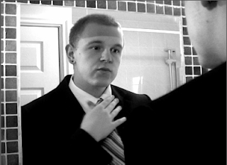
The music video includes a lot of repetition, another convention of modern day music videos. Seeing as my video tells a story as well as having an artist performance, repetition is good in the storyline to allow the audience to get to grips with the narrative and properly understand it. Sam is shown four times doing his tie up in a black and white colour, which really proves a point to the audience, that he does not want to be stuck in his 9 to five job anymore, staring into the same mirror in the same mood.

Another convention that I used, along with the lighting convention, is the colour effects I edited into my video. I really wanted to contrast the storyline against the artist. As the narrative explains a love story becoming something new and coming into its own, I wanted to make the colours warm and bright, against the dark and indie colours of the artist (black and white, threshold). I therefore changed the colour balance to make it look as though the couple is in a sunset colour whilst they go through their new lives. The reds and oranges that reflect off them in each scene, after they dissolve back in and seem happier, prove the point that things have changed for them and they are now in a brighter and happier place. Edits to colour are a huge convention of modern-day indie music videos. A lot of artist/bands use colours to enhance the way they want to look or the way they want their video to come across, which is what I was going for, I wanted to make the couple’s scenes richer and differ completely from the black and white they were in before, as they are out of the dark and into the light. An example of this is seen in the scene where Alex and Sam both run out of the house, the bricks can be seen in a rich brown and red colour, which is definitely eye-catching.


I also challenged the conventions of indie music videos by using a few dissolves. It seems that a lot of straight cuts are used in music videos, which I have used throughout my edit, yet, seeing as my artist’s song matches with the dissolves they work well. There are parts in the video, for example the lines ‘washed out and fade away…’ and ‘patterns begin to fade…’ which have meanings to allow the dissolves to work. When the couple is together, yet ‘fading away’ the fade comes into play and gives a good effect on the lyric. The dissolve narrates the couple’s lives slipping away from them day by day, allowing the audiences the opportunity to understand by watching this happen as well as listening to the lyric. The fade in with a white colour also does this. We see the ‘patterns fading’ when the fade in occurs and the couple are no longer in a dim, dark colour but a bright and rich colour, giving a warm and happy feeling.

How effective is the combination of your main product and ancillary texts?
My artist’s website conformed to a lot of different conventions. I used inspiration from Mumford and Sons, saw how simple they made their website and decided that seeing as ‘indie’ follows the idea of simple, yet modern, I would imitate this. I included simple buttons and pictures of the artist as well as the front cover of the cd on the front page. Including a picture of the CD cover allows the audience to get a feel of the connection with the CD and the website and possibly encourage them to buy the CD.
I also made sure that I kept to the colour scheme that I had used on both CD cover and website. Blue, black and yellow (sometimes white) were the colours that are tagged to the artist.
Buttons were another of the ideas that I conformed to whilst creating my website. The buttons are each linked to separate pages, which also have the buttons on them too. This allows the audience to browse through the site with complete ease. When they click onto another page, they are able to choose the next page to visit whilst they are on any page, they don’t necessarily have to be on the home page to link to different page. The colour yellow is used throughout the website text as well as the CD text, so I made sure this was consistent to ensure it looked professional. The buttons are also outlined to make it look neat as well as having ellipsis’ after each word as a ‘tag’ for the artist.
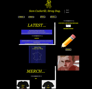

Pictures of Sam are used on the website which allows the audience to relate to him as they know what he looks like, the clothes he wears and his body language. The pictures that I took of Sam were each edited into a red colour which sticks with the bright, edgy layout that has already been designed for the homepage. Editing the pictures gave the website a young, modern feeling. Whereas, when they were in normal colour, they did not stand out or look as effective. Also the fact that I used a picture of Sam on the CD cover links back to the website, allowing the audience to get closer personally to the artist as they can see his face and style in a variety of media technologies.
A convention that is definitely used more in the modern day than it ever has been before is merchandise selling. Pretty much all artist sell merchandise at their gigs and on their websites. I decided that I wanted to follow this convention and design a few t-shirts and hoodies for the fans of Sam Cockerill; Stray Dog.
These pieces of clothing are effective on the website as they allow the audience to get even closer to the artist by having the choice to buy designs that have had the influence of the artist’s taste.
Another convention that I used within my website, also seen on Mumford and Son’s website, is the title and logo at the top of the page. The title ‘Sam Cockerill; Stray Dog’ and cartoon picture of a yellow outlined dog is edgy and different. Many bands have a ‘tag’ that audiences recognize them by and the dog at the top of the homepage is Stray Dog’s tag. I also thought that having the logo above everything else on the page would make it look very effective as it is the first thing that the audience see and should stick in their mind as the small icon that associates with the artist. The font was also bigger than any other text on the CD cover or the website which made it stand out and become, obviously, the most important piece of text.

My CD cover carried the same theme as my website. The same conventions were used, bright colours and pictures of the artist to ensure that it was effective as possible to connect the audience with the artist.
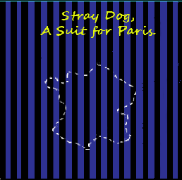
The background of the front page on the CD cover translates the first line in the song ‘You’re Pinstriped’. I wanted the song to relate to the CD cover as much as possible as it’s his first single and the first album he has made. I therefore put this into play by making the background of the first face into black and blue pinstripes. The colours are uni-sex and therefore can be targeted at any gender. This was necessary as I did not want to make the target audience specific I wanted it to be as wide spread as possible to allow my artist to get as much publicity as possible. The font used was Segoe script, bold at size 24. I made sure that I used the same bright yellow colour to contrast against the blue and black background. By using the same colour and type font on both ancillary texts, it acts as an advertising campaign for the artist.
A convention that is definitely used more in the modern day than it ever has been before is merchandise selling. Pretty much all artist sell merchandise at their gigs and on their websites. I decided that I wanted to follow this convention and design a few t-shirts and hoodies for the fans of Sam Cockerill; Stray Dog.
These pieces of clothing are effective on the website as they allow the audience to get even closer to the artist by having the choice to buy designs that have had the influence of the artist’s taste.
Another convention that I used within my website, also seen on Mumford and Son’s website, is the title and logo at the top of the page. The title ‘Sam Cockerill; Stray Dog’ and cartoon picture of a yellow outlined dog is edgy and different. Many bands have a ‘tag’ that audiences recognize them by and the dog at the top of the homepage is Stray Dog’s tag. I also thought that having the logo above everything else on the page would make it look very effective as it is the first thing that the audience see and should stick in their mind as the small icon that associates with the artist. The font was also bigger than any other text on the CD cover or the website which made it stand out and become, obviously, the most important piece of text.

My CD cover carried the same theme as my website. The same conventions were used, bright colours and pictures of the artist to ensure that it was effective as possible to connect the audience with the artist.
The background of the front page on the CD cover translates the first line in the song ‘You’re Pinstriped’. I wanted the song to relate to the CD cover as much as possible as it’s his first single and the first album he has made. I therefore put this into play by making the background of the first face into black and blue pinstripes. The colours are uni-sex and therefore can be targeted at any gender. This was necessary as I did not want to make the target audience specific I wanted it to be as wide spread as possible to allow my artist to get as much publicity as possible. The font used was Segoe script, bold at size 24. I made sure that I used the same bright yellow colour to contrast against the blue and black background. By using the same colour and type font on both ancillary texts, it acts as an advertising campaign for the artist.

As well as bringing across the idea of the song and the artist on the front page, I used a picture of the Eiffel Tower, a picture of the artist and his guitar and an outline of France on the front face. Each of these conventions brings across the personality of the artist. ‘A Suit for Paris’ is the name of the single, so I realised that an image of the Eiffel Tower would be appropriate as well as recognized widely from an audience point of view. Pictures of the artist was an idea that I had conformed to on the website, so thought that having him on the CD cover would also be suitable. This time, though, I changed the colour from the red edits on the website to a black and white for the CD cover as if the colours were red, it would not match with the rest of the cover.
What have you learned from audience feedback?
I made sure when I started my journey through audience feedback that I got a range of different people to hear from. I wanted different ages and different genders. In my class, I have a range of different genders, as well as having my parents (and older age range) and also Sam, who is 20.
The feedback I received was both positive and critical. My class mates and I each wrote down comments from each other after viewing music videos. This was an effective way for me to understand the comments as well as analyse how I would try and change things.
My class mates commented that they very much liked the fact that my artist was in a black and white polarized colour. This was very encouraging as I wanted to make my artist stand out as much as possible from my storyline. My audience also liked my use of a wide range of shots when my artist is used. This was helpful to know because I had tried to make sure that Sam’s shots were as entertaining as possible to ensure the audience would become enthralled and not lose focus, which conforms to Archer’s theory of creating a sense of rhythm.
A particular shot that was popular with my audience was one of Sam looking straight into the camera and singing his lines. This gives the audience insight into the artist’s emotions as when the viewer watches, they will staring into his eyes as he says ‘maybe we can make this change’. This convention follows the theory of Dyer as he suggests it creates a sense of intimacy between the audience and the star.

Another piece of particularly positive feedback was due to my use of repetition throughout the video. My audience liked the idea that this part linked with the words and to the song. Also the fact that it is sped up allows the audience to get an idea of the couple’s life over and over again. This is a common convention used in modern day music videos, so the fact that it was liked by my audience was reassuring.
I made sure when I started my journey through audience feedback that I got a range of different people to hear from. I wanted different ages and different genders. In my class, I have a range of different genders, as well as having my parents (and older age range) and also Sam, who is 20.
The feedback I received was both positive and critical. My class mates and I each wrote down comments from each other after viewing music videos. This was an effective way for me to understand the comments as well as analyse how I would try and change things.
My class mates commented that they very much liked the fact that my artist was in a black and white polarized colour. This was very encouraging as I wanted to make my artist stand out as much as possible from my storyline. My audience also liked my use of a wide range of shots when my artist is used. This was helpful to know because I had tried to make sure that Sam’s shots were as entertaining as possible to ensure the audience would become enthralled and not lose focus, which conforms to Archer’s theory of creating a sense of rhythm.
A particular shot that was popular with my audience was one of Sam looking straight into the camera and singing his lines. This gives the audience insight into the artist’s emotions as when the viewer watches, they will staring into his eyes as he says ‘maybe we can make this change’. This convention follows the theory of Dyer as he suggests it creates a sense of intimacy between the audience and the star.

Another piece of particularly positive feedback was due to my use of repetition throughout the video. My audience liked the idea that this part linked with the words and to the song. Also the fact that it is sped up allows the audience to get an idea of the couple’s life over and over again. This is a common convention used in modern day music videos, so the fact that it was liked by my audience was reassuring.
Other feedback was also very constructive as the audience thought the richness of the colour on the couple’s scenes made the video seem more professional. Before I had edited this, the colours seemed slightly dim.
I also received some criticism. My audience thought that the song choice was not a brilliant one and the lyrics were hard to understand as they were quite quiet. It was hard for me to be able to change this at such a crucial point in the process, and at the start of the project I was let down by a colleague and therefore had a short amount of time to come up with a new song. Yet, I took on board the criticism from my audience and asked the artist to turn up the volume on the recording and re-send it to me. This was a success and did make a little bit of difference. If I could go back and make some changes, I would definitely have changed my song choice.
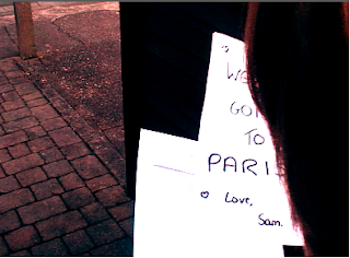
Another piece of criticism given to me from my audience was the fact that the storyline was not as clear as it possibly could be. The fact that the Paris ‘ticket’ was not shown and was slightly shabby made it un clear that the male was taking the female away for a while, which is the main point of the narrative. This was unfortunate and I realised now that I should probably have made an insert where the ‘ticket’ went, but regrettably did not have time. Continuity was also a criticism I obtained. The fact that when the car reverses off the drive there is no passenger in the passenger’s seat makes the video look less professional. I also unfortunately ran out of time to be able to re-film this part of the video.
The website audience feedback I received was pretty positive, but did have a few criticisms.
The first positive comment was on the ‘latest’ section of the homepage. My audience liked the fact that the news was straight in front of them when they logged onto the webpage. Each piece of information has a blue background and bright yellow writing and really stuck out to viewer and also conformed to the rest of the colour scheme on the website. I agree with this comment as this draws the audience’s eye straight to the middle of the page and entice them into reading more about the artist as well as searching through the rest of the website.
In addition to this, feedback such as suitably sized hyperlinks which allow the audience to search through the website as easily as possible.
Another positive point made by my audience was about the merchandise on the homepage, a lot of the feedback was based around the merchandise and how professional it looked.
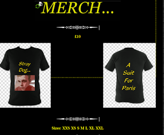
Seeing as a lot of indie bands are putting out t-shirts with their faces and ‘tags’ on them, the convention really sticks to what is being released around this time. Also the fact that both the ‘latest’ and ‘merch’ sections were in scroll-bar boxes, according to feedback, makes the home page look edgy.
The title and logo at the top of the page were also a hit with the audience. They liked the fact that the artist had his own shape to be recognized for and though it was a good convention to use.
Some criticism that I found from my feedback started with the fact that there were no tour listings on the homepage. Yet, I did explain the fact that this information would be in the news section and that if the hyperlinks were used, they could find this out there. If I were to do the homepage again, I would ensure that there was more information on the tours and a specific link for them.
Another criticism that was made is that my buttons may have been a little too simple. There could be some sort of flash used when the cursor roles over the button, or it could have been a different shape. However, I was still pleased with the buttons that I made as I did not want to overcrowd the homepage and make it look trashy.
My digipack also received both positive feedback and some criticisms.
My audience liked the way that my digipack was laid out. The fact that you can open it from two sides and see the CD in the middle allowed them to be able to see the art around the main point (the CD). The front page was especially commented on as it connected with the song as well as having an unusual shape on the front (France), yet it still linked back to the song and gave the front face a personal feel.
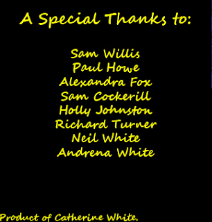
Another good point of feedback I received was the fact that my audience liked the idea of thanking certain people on the inside of the cover. Comments were things such as ‘this makes it seem as though it’s really coming from the artist, not just the manufacturer’. This was very encouraging as seeing as though my artist is a solo; it means more for him to be as connected as possible with his target audience.
One piece criticism that I got from my audience was that the back of the cover, where the titles of the songs are, was a bit plain and I could have placed an image of an instrument, or even my artist, above the song titles. However, after looking at a few CD covers I will have to disagree with this comment as quite a lot of the covers I have seen have been simplistic on the back due to busy front pages.
My audience also thought that I could have made my CD holder a little better designed as that was also quite basic. This could have been changed as two simple faces inside and outside on the same slide looks a little unprofessional, however I am still pleased with the overall outcome.
How did you use new media technologies in the construction and research, planning and evaluation stages?
As I was put back about a month due to having to start again after my partner left school, I made sure that researching for my artist was made much simpler. To get the permission from the artist that I chose due to friendship, I used emailing via hotmail as a form of media. This allowed me to let my artist know any details he would like as well as enabling me to get the permission from him as soon as possible for the rest of the project.
I also used Youtube, Facebook and TV music channels as other means of media. Youtube and music channels allowed me to look through a variety of different music videos to try and get inspiration and ideas to add into my video. For my research I looked through music videos that I knew well and analysed them to realise Dyer’s theory of stardom. Facebook was another way for me to get in touch with my artist. I needed to make sure that I contacted him in more ways than one to ensure that I would definitely get a reply in the near future. This saved a lot of time as it worked out that he got the Facebook message faster than the email to his hotmail account. Without the social networking site it may have taken a lot longer to get in contact with him, so it saved a lot of time.

During the editing process I used a lot of un-natural colouring. The only way that I was able to make this happen was through Adobe Premiere Pro, another form of media. I dragged threshold, colour balance and brightness and contrast onto various different shots to enhance them. Without this form of media my video would not have been able to develop the scenes and the audience would not have got the overall effect that I really wanted to make.
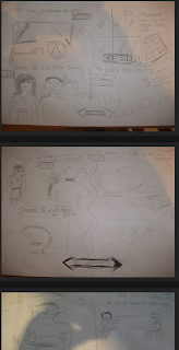
Also throughout the construction stages of my storyboard, I used a lot of still pictures from a digital camera, another source of media technology. Without these pictures I would not have been able to upload drawings of what I presumed the storyline would look like and planning would not have been as simple for me. Making the storyline animated as I uploaded my coursework gives the audience a much better idea of what the eventual piece may look like.

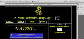
During the construction stage of my website, I used the programme Dreamweaver. This software allowed me to upload pictures, make a table to lay out all the information I wanted to insert and also keep checking on the internet of what it would look like to the audience. The software also allowed me to move my text and images around on the page, this was really helpful as it created a structure for the website and made it a lot easier to create. Dreamweaver also allowed me to create hyperlinks for different pages, even though this was not expected, which makes the website more interesting for the viewer.
I also used Photoshop Pro throughout the construction stages of my website. Using this programme meant that I was able to edit pictures of the artist to make them more interesting as well as look more indie and modern. Creating text on Photoshop was also very helpful as without it I would have had to use a programme such as ‘paint’ and it could have looked less professional as well as taking up more time.

I also used Photoshop Pro throughout the construction stages of my website. Using this programme meant that I was able to edit pictures of the artist to make them more interesting as well as look more indie and modern. Creating text on Photoshop was also very helpful as without it I would have had to use a programme such as ‘paint’ and it could have looked less professional as well as taking up more time.
I also used Photoshop on my CD cover. This was great as I was able to set a layout of three pages for the front and three for the back, all spaced out and sized the same to look professional and clear for the consumers. Being able to create text as well as import images and edit colours all in one piece of software made it very simple to change any ideas I did not like, experiment with different designs and stick to the colour scheme I had chosen.
Whilst writing my evaluation and updates on my coursework, I used www.blogspot.com. I could show my progress on all three ancillary texts through this media technology as it is simple to upload photos and videos and write information that is necessary to the project. It is a great way for the audience to follow the development of my final piece. As the site allows me to upload screen shots and digital images, the audience see what I have been doing as well as reading more detail about it, this will give them a better idea of exactly what the final project will look like. Embedding videos is also a great way to animate texts such as my digipack to ensure the audience know exactly how it will look. I can also embed music videos from Youtube such as Paramore and Forever the Sickest Kids which adds to the text when I am analysing the videos or talking about a particular convention from it on my blog.
Blogspot is also very handy for ensuring that all of my work is up to date as well as keeping it in time sequence. If I was to hand write all of my coursework, it may be harder to understand and edit as well as keep up to date with.


No comments:
Post a Comment